

the background
In Portuguese, Porto Velhotes roughly translates to something like “Old Timers Port.” And as a brand, Porto Velhotes had indeed aged — not in the good, barrel-matured way. It hadn’t communicated in years, its packaging felt outdated. Much like the Port category itself that seemed dusty and stuck in the past. It was tied to outdated traditions, consumed only on rare celebratory occasions, and wrapped in elitist status symbols that the brand could never realistically compete with.
the challenge
Our goal was to rejuvenate Velhotes without losing its authenticity or alienating its core audience — a broad, popular base that had always driven its sales. We wanted the Velhotes we remembered from our youth — the one served at home on family occasions — to be embraced once again by a new generation of adults. And we wanted to position Port as something to enjoy regularly, for pleasure, not just on special occasions.
Solution
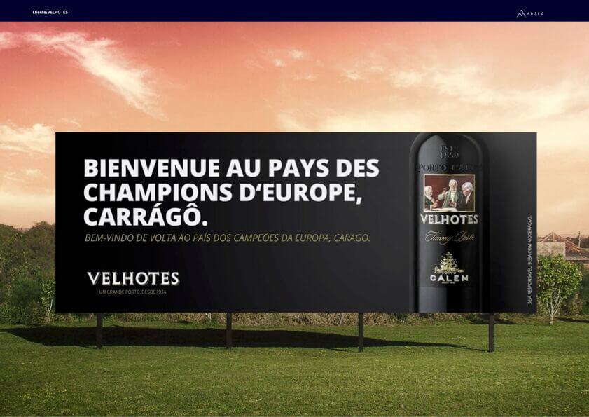
The brand’s greatest strength lies in its emotional value, it’s heartfelt connection. Knowing that the elite often championed more refined Ports, we positioned Velhotes as the Port wine actually embraced by the people of Porto.
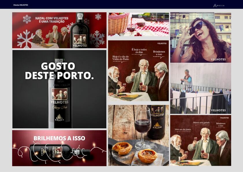
On social media, we brought the three iconic characters from the label to life. Using a humorous and local tone, we leaned into the brand’s strong, proudly Portuense identity. Through spontaneous photos of the people of Porto, we revealed its authentic soul.
We also refreshed the packaging and introduced new visual assets that highlighted the richness and flavor of the wine.
RESULTS
The campaign propelled Velhotes to the number one position in volume — a leadership it still holds today.